I think I have written enough articles about Geron (GERN) to let the readers make an educated investment decision. I have discussed the history of the company, Imetelstat, a valuation model, details of the secondary offering, and finally the fact that it was the institutions that almost doubled their positions since the November 2013 pop in the price.
There is nothing more to say. Yet, there has been a lot of “technical signal” talk around the stock recently. Now, despite my stated position that biotech investing is highly speculative and will only pay off with diversification and over a very long time horizon, I will go over how I “would have” viewed Geron if it were part of my technical trading schema (which it is not).
As a caveat and the reason Geron is in my conviction and not technical trading list, Geron fails that basic market cap/stock price test, and as such, the rest of this discussion is academic. You see, technical analysis in my view is all about probabilities. Hence, you will need a “cushion” for the inevitable “being wrong.” I view a stock price above $10 and a market cap above $2 B as enough of a hedge to “find the company still listed” the next day. Yes, that did not help some names we remember from days long gone, but the existence of the price cushion at least gives you a warm fuzzy feeling that there may still be something to salvage if the floor drops.
Back to technical analysis. The first thing to look at for me is the long term monthly charts. I view these as a proxy for the most fundamental fact (and possibly the only one) that we know about the market, and that is that market prices move according to a random walk around an average or a mean. We call this “log normal mean reversion.” The mean that the prices move around is, for me, the long term moving average. Hence, if the charts are pointing upwards on the monthly scale, then the expected yearly rate of appreciation is the slope of the price curve. If it is pointing downwards, then there is no point of fighting the market game.
Looking at the chart below, you can clearly see that this recent alignment is a relatively rare, and usually short-lived incident in the life of this company. As such, what distinguishes this recent episode from the previous two in the last 10 years is that it is quite longer in duration (sixth month and counting).
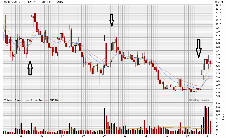
Here it is definitely worth mentioning that technical analysis is about the past and as such is always “lagging.” Hence none of us would have anticipated in September (based on the above chart pattern) that this is a dominating and non-temporary phenomenon. Especially given the history of this particular equity, as demonstrated in the chart. I can now look at it and say with certainty that the market judged GERN as an appreciating asset starting around Fall 2013. I can further assert that this judgement had a unique commitment we did not see in a whole decade, despite (temporary) higher percentage appreciations in the past.
In October a persistent technical analyst should have noted something special and unique when the short-, mid-, and long-term monthly patterns aligned, while the price chart was still exhibiting appreciation. Prior to that, most – myself included – would not have deemed GERN as an investment grade company.
The reason the conviction would have been sealed this time around is that, as you see from the chart below, for the first time in years, the weekly pattern was sustained long enough and strongly enough to reflect itself on the monthly charts.
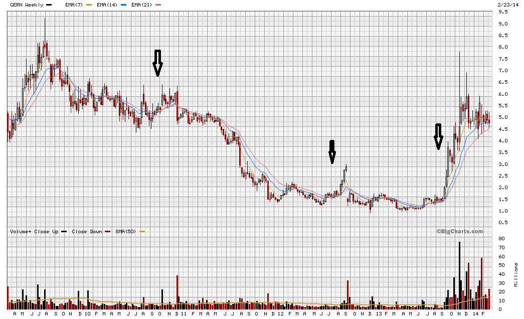
This event itself is rare for the weekly in the past few years as the chart above indicates, but what makes it more unique is that it is the first time that the monthly charts were exhibiting my favorite alignment with the monthly charts showing this strong similar pattern.
In effect, the new found market conviction was there for all of us to see around October and well before the spike of November 7.
If you are a long term investor then these are the patterns you need to keep an eye on. Much more so than the daily pattern that we have seen articles written about recently. In particular, the Flag pattern that was discussed (as shown below) is a reflection of the new found long-term conviction described in the charts above. Actually, comparing the chart below with the one above clearly indicates the slow moving weekly average as acting as the bottom of the “flag.”

After all, range-bound trading — be it the flag or the properly-aligned long weekly and monthly averages — suggests that enough people believe in the quality of the investment in the equity to actually rise to the plate and commit money if it drops below a reasonable amount. That reasonable amount is their view of the proper price appreciation (the mean in the mean-reversion discussion above).
In conclusion, I believe that the market conviction at this point is that 100% yearly appreciation (from $3 as the base today) is the expected return for the stock in the coming months, barring any significant event. It seems this is what the market is willing to commit to in the absence of new events or news.
Incidentally, this jives well with the low end estimate in my valuation model, considering that the MF trial – and nothing else – is currently the headline news. Now if, as Dr. Tefferi’s latest presentation suggested, other MPN diseases are thrown in the mix, then my higher end valuation is what would be the (possibly conservative) base.
This is my “technical” take on Geron. I know that many of the concepts discussed are not what people advocate in technical analysis, but this is the approach that served me well over the last few years, and as mentioned in the previous paragraph, it seems to coincide – at least for this particular equity – very well with my fundamental analysis and valuation models.
DISCLAIMER: I am Long GERN.
